Hey, kids!
Do you like Bullfrog?
No? Because you don’t know who they are?
Fair call.
In the same way our modern dystopian hellscape is ruled by a handful of triple A publishers obsessed with making the line go up, the collective childhoods of my generation were filled with a handful of monolithic publishers and prolific designers, who delivered an entire comfort zone of video games to our doorstep.
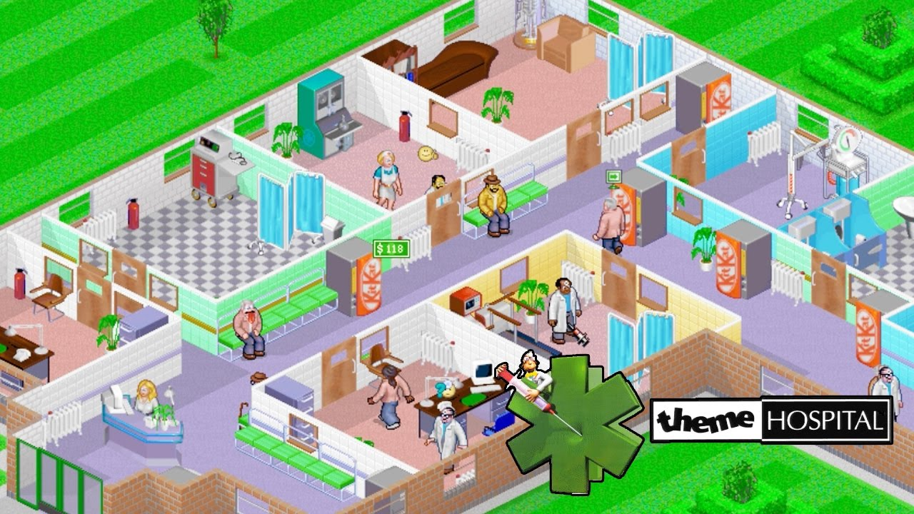
One such marvel was Theme Hospital.
A light-hearted healthcare themed management simulator, Theme Hospital was one of many slam dunk titles produced by the now-dead Bullfrog games – killed by EA after they stopped making the line go up to a satisfactory degree.

Thanks, modern game industry, keep the change.
But whilst Bullfrog has passed into memory, the minds who delivered those games live on – for now, at least – and two of then went on to found Two Point Studios.
…which was immediately purchased by Sega. Fuck you, games industry!
The good news is that the studio was allowed to exist in its comfort zone of producing management simulators – Two Point Hospital in 2018, and Two Point Campus in 2022.
Now, when we, the general public (the ones who aren’t hyper fixated on pointless bullshit like whatever’s wrong with Dragon Age: Veilguard, which is nothing - yet) hear the words “Spiritual Successor”, there are two possible paths for such a title.
One, it’s derivative garbage which fails to grasp what made the source material such a groundbreaking title and feels like a cheap and hollow imitation (hello, Yooka-Laylee!)
Two, it understands the assignment and uses the original material as a jumping-off point to produce an even better experience for the consumer.
Where did Two Point studios land with Two Point Hospital?
Well, it is the humble opinion of this pretend critic that we are firmly in the second category. Whilst Theme Hospital was an amazing game, which oozed character, stylish visuals, and not a small amount of comedic charm, it was limited by the technology of the day, and did have some mechanical niggles that often undermined the best efforts of the player (looking at you, surgery room that was impossible to keep staffed!)

Set in Two Point County, you are tasked with managing a string of new hospital projects in a variety of different locales, each with their own set of mechanics and challenges. The word of the day here is “depth”. The first two or three levels hold your hand, but it’s not long until you start getting chucked into the deep end of the pool, with the lifeguard actively hunting you with a shotgun.
There’s going to be a lot of references to Theme Hospital and what has been improved in the interwar years, so, apologies in advance.
The original charm of Theme Hospital, such as the bizarre physical comedy, stupid illness names, and odd background information for your hospital is still here. You will treat patients that believe they are Freddy Mercury. You will create treatment rooms whose sole purpose is to stick a giant needle into the back of an unsuspecting patient. You will hire a doctor whose name is “Joe Nuts”. And it will all be set to a banging soundtrack, complete with radio host skits, and commercials for in game items.
(Does anyone feel like some cheesy gubbins right now? I sure do.)
Those radio hosts in particular feel well written – they conjure fond memories of the jovial but stupid DJ Stryker from Burnout 3. The conspiratorial Harrison Wolf, the posh and prim Sir Nigel Bickleworth, and the bombastic Ricky Hawthorn. It feels like each character has hundreds of lines of dialogue, which all help to build the world – something the original Theme Hospital struggled to do.
It brings a wry smile to my face every time I hear Sir Nigel complain about callers to the radio station calling him names and hanging up, or Mr. Hawthorn having a meltdown on a hot mic.
Two Point Hospital feels like it was made from a place of love, and it shows.
Having established Two Point Hospital has the same tongue-in-cheek writing, what about its visual design?

The original Theme Hospital was very stylish, in a way that still holds up. Two Point Hospital has moved to 3D models and is stylish in its own way. It’s not on the cutting edge of graphics technology, but the style is still memorable and charming in its own way. There’s not been a point where I’ve looked at the way the models walk or interact with the world around them and thought “gee, that’s a bit shit, isn’t it.”

Which, admittedly, is a low bar to clear – but I think Two Point Hospital’s real strength is the design of the objects in the world, and the much higher resolution. Which does feel like a given.
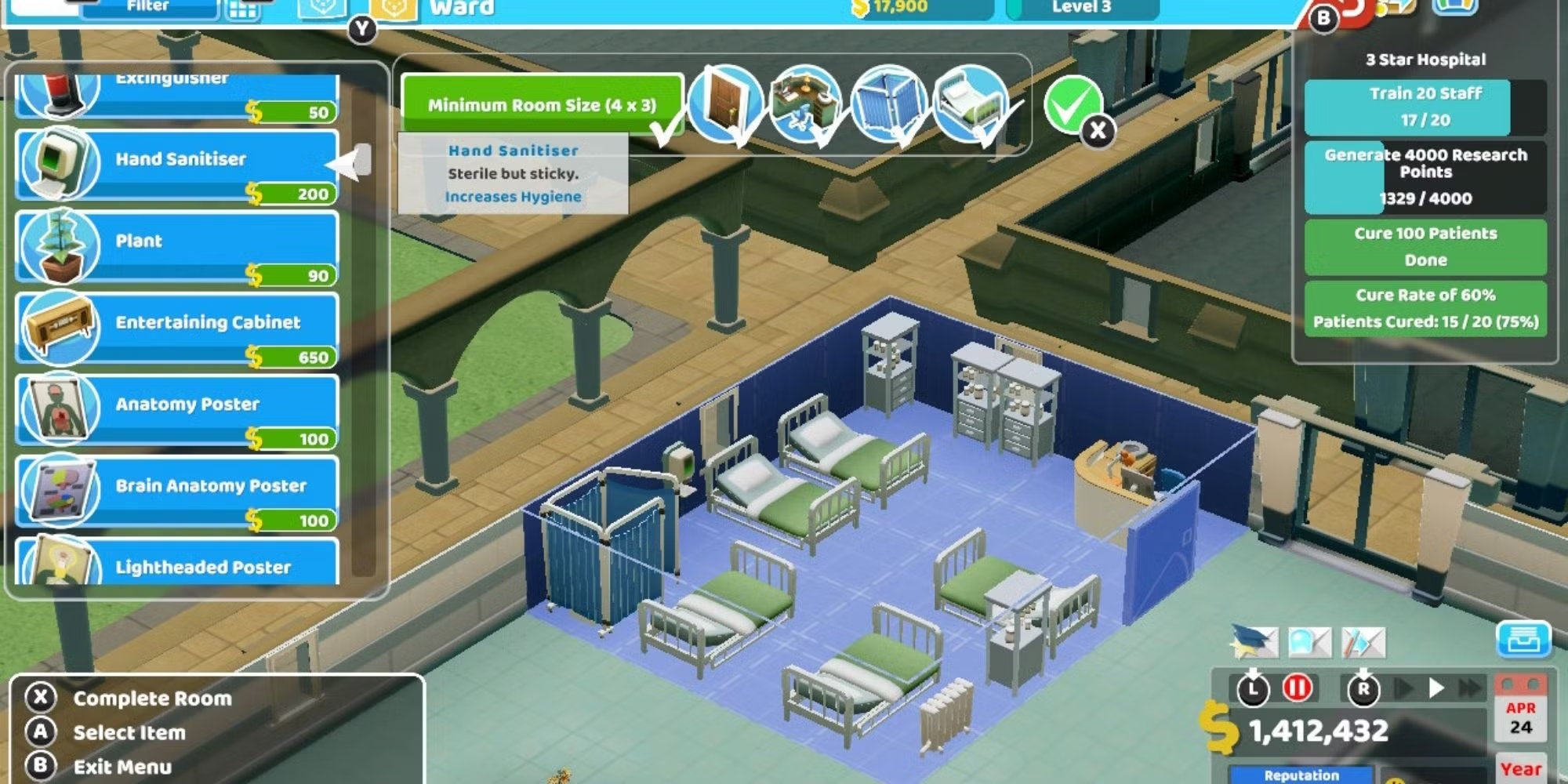
The equipment in each room is visually interesting, but also distinct in its design - which is a mark of quality. Even at an extreme distance, you aren’t going to mistake one room for another. You aren’t going to mistake a De-Lux clinic with a Clown clinic, for instance. And watching as patients get treated in each room is interesting, and sometimes genuinely funny – like a patient having the pan sucked off his head using industrial strength magnets.

Where Two Point Hospital really stands apart from Theme Hospital is the depth of its mechanics. Whilst the premise remains the same – build rooms, hire staff, treat patients, get money – There’s so much more here.
There are more rooms. More ways to train and manage staff. More items to buy for the corridors of your hospital. And in an admission that receptionists can do a lot better than stand motionless behind a desk directing patients, the range of options they have has expanded greatly. Now they can conduct marketing campaigns, staff cafes, and sell newspapers to patients.
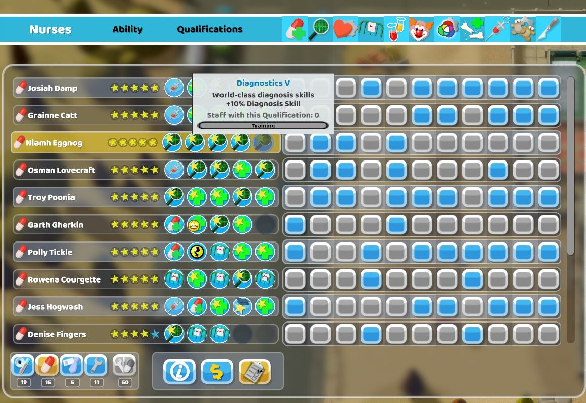
I found the revamped training system to be very satisfying to use. Yes, any old doctor can sit in the GP’s office, but now you can train specialist general practice doctors. Whilst you could always train researchers, psychiatrists and surgeons, now you have so many other options, and the system has been expanded to all categories of staff, with unique options for each.
And trust me, you’ll crave a specialist GP even more after you watch your boneheaded junior doctor fuck up a string of diagnoses and make more work for the rest of your hospital.
You also have much greater control of the staff and rooms in your hospital. Don’t want your ward-trained nurses anywhere other than the ward? Done. Don’t want your specialist mechanic unblocking toilets when you have six machines to upgrade? Your wish is his command. Want to create a Psychiatrist room exclusively for diagnosis so you can build a second Psychiatrist exclusively for treatment further away? Go hard.

The reward for being able to navigate all of these interlocking systems is a Hospital that is so satisfying to watch in action. Your expertly trained GPs instantly diagnosing patients, sending them straight to your treatment facilities where your fully upgraded machines maximise your chances of curing them. It just feels... magical.
The game is not without its niggles, however.
The user interface can be miserable to navigate through, especially once you have double-digit numbers of doctors and nurses – and there’s no way to see exactly how many rooms of a particular type you have in your hospital, besides cruising around and counting them all yourself. And I’m not fond of the absolute laundry list of items you eventually scroll through to find the one item you need at that given moment.

Looking at you, Yucca plant buried at the bottom of the list under all the Sonic shit added in a DLC pack that I can’t switch off.
Speaking of “that Sonic shit”, whilst I understand the developers wanting to show loyalty to Sega by adding items from another franchise into the game, good lord is it frustrating when you scroll past fifteen Sonic-themed items, none of which are a good fit for the tiny hospital empire you’re trying to build.
I hasten to add that these are small potatoes, however.
Ultimately, I think Two Point Hospital is a title that very much understood the assignment. Take a cult favourite from a studio that doesn’t exist anymore and elevate it. I don’t think the game does enough to be considered a “Perfect” game, but it is very firmly in the “Great” category. I’ve spent a lot of time with it, which is not something that happens with awful titles. And at the conclusion of this review, after bedtime, I will definitely be playing more.

And maybe, just maybe, I’ll try the other Two Point games when they get released.
Catch you next time,
Vulkan
Critical Information Summary:
Review Platform: PC
Developer: Two Point Studio
Publisher: Sega
Cost (At Time of Publish): $50
Did you like this article? Did you hate it? Go over and keep the discussion going on the official Vulkan's Corner facebook page! - whilst you're at it, leave a like!

